


The Weather Channel: Premium
Drive account sign-ups and Premium Subscription purchases by delivering a more user-friendly, cross-platform UI with an emphasis on improving the award-winning Radar feature.
The Weather Channel introduced free accounts and Premium Subscriptions - including Premium Radar - launching first on the web, then expanding to apps. As sole designer, I worked across Product, Engineering, and Marketing to serve three user types: New, Returning Free, and Premium.
Our existing Radar feature had real gaps: a confusing timeline, a buried layers feature, and differentiators hidden behind an obscure button. This project modernized Radar end-to-end and built out the Subscribe screens (developed with marketing) as the purchase landing page - using storytelling, data, and innovation to position The Weather Channel as the leader in perceived accuracy and precipitation storytelling.
Role
Product Designer
Timeline
2021 - 2023

"Radar usage within the app increased almost 2.5x, from 100M to 250M per month. We believe that radar is our single biggest opportunity to solve in a competitive weather market landscape."

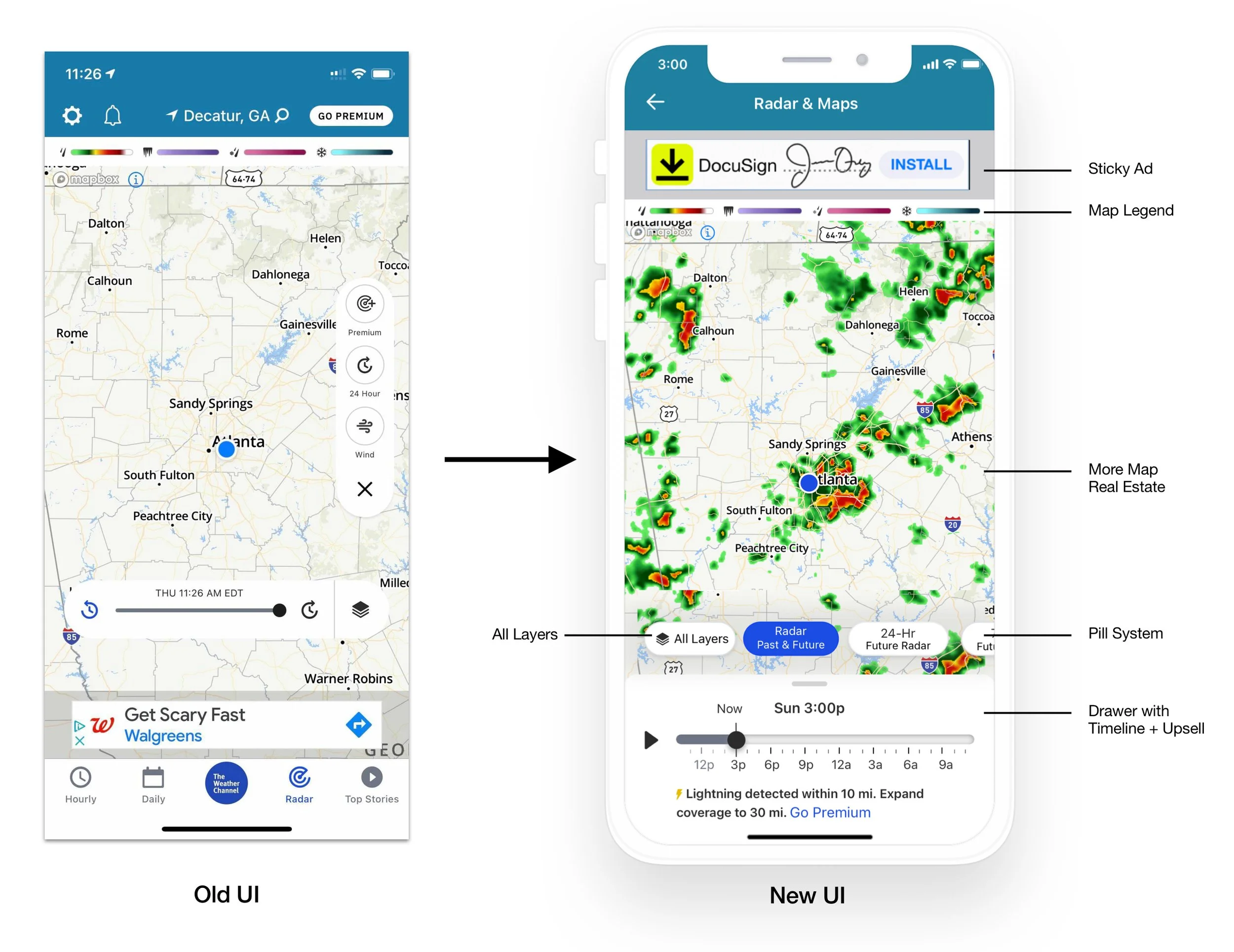
Before & After
We cleared the map canvas - removing the floating action button and timeline - so the data could take center stage. In their place: a Carousel Pill System, a streamlined nav layer with four default options - Basic 8-Hour Radar, 24-Hour Future Radar, 72-Hour Future Radar, and Layers/Overlays.
The timeline moved to the drawer, which now doubles as a home for editorial content, severe weather alerts, and premium upsells - a low-friction path to Premium conversion.
The result: more clarity, more value, less clutter.

Radar in action
To ease users into the new UI, we introduced contextual onboarding tooltips that guide them through the experience step by step - reducing friction and ensuring no one feels lost or overwhelmed.
We also launched a GPS feature that gives users a reliable way to return to their original map position after exploring. To keep the interface clean, the GPS icon appears only when a user has navigated away from their current location.

20-40 million users visit the website daily.
We are targeting 1% of the US audience without partners (60M users > 600K) to purchase Premium.
Considerations & Stakeholders
Web: Ensured a seamless integration without disrupting the existing weather.com experience.
UPS 2: Built the backend user management system powering sign-up, login, and purchase flows.
Piano: Third-party partner who handled the payment process. I designed the payment modal around their existing capabilities, with ongoing collaboration to refine the implementation. Their platform came with constraints - most notably, requiring a modal rather than a dedicated checkout page.
Privacy & Legal: Ensured full compliance throughout.


Cross-Platform Compatibility
iOS App (iPhone + iPad)
Android App (phone+tablet)
Website (Desktop)


Business Impact
As the #5 Most Trusted Brand in America, this launch reinforced our commitment to privacy, security, and accessibility - all while keeping users at the center of every decision. The results spoke for themselves: 100,000 new subscribers in 2021, reaching 1 million active subscribers by January 2022, validating users' willingness to pay for premium, decision-driving content.

Intensive cross-functional collaboration - from Product to Engineering and QA to Executive Leadership feedback - drove the project's success. The effort paid off personally, too: I earned my first promotion, was featured numerous times in the company’s newsletter, and made a measurable impact on 2021 revenue.


I also got the opportunity to flex my illustration skills and design this commemorative t-shirt (and matching stickers), which were sent to the entire org to celebrate the launch! Undoubtedly, my favorite part of this project :)